文章詳情頁
python實現(xiàn)時間序列自相關(guān)圖(acf)、偏自相關(guān)圖(pacf)教程
瀏覽:96日期:2022-07-23 10:13:27
自相關(guān)圖是一個平面二維坐標(biāo)懸垂線圖。橫坐標(biāo)表示延遲階數(shù),縱坐標(biāo)表示自相關(guān)系數(shù)
偏自相關(guān)圖跟自相關(guān)圖類似, 橫坐標(biāo)表示延遲階數(shù),縱坐標(biāo)表示偏自相關(guān)系數(shù)
自相關(guān)圖與偏自相關(guān)圖的python代碼實現(xiàn):
from statsmodels.graphics.tsaplots import plot_acf, plot_pacf
plot_acf(b.salesVolume)plot_pacf(b.salesVolume)
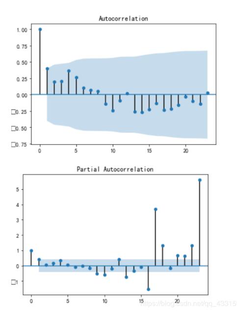
可以看到,這個數(shù)據(jù)是偏自相關(guān)系數(shù)拖尾,自相關(guān)系數(shù)截尾的數(shù)據(jù)
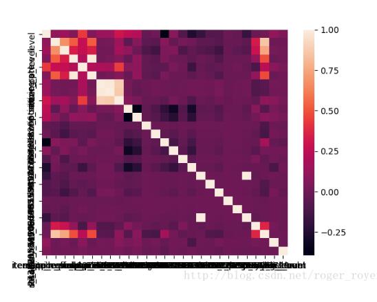
補充知識:python 數(shù)據(jù)相關(guān)性可視化
話不多說直接上代碼
import matplotlib.pyplot as pltimport seaborn as snsdata = test_feature.corr() #test_feature => pandas.DataFrame#sns.heatmap(data)plt.show()
效果圖
以上這篇python實現(xiàn)時間序列自相關(guān)圖(acf)、偏自相關(guān)圖(pacf)教程就是小編分享給大家的全部內(nèi)容了,希望能給大家一個參考,也希望大家多多支持好吧啦網(wǎng)。
相關(guān)文章:
1. CSS3實現(xiàn)動態(tài)翻牌效果 仿百度貼吧3D翻牌一次動畫特效2. ASP.NET MVC使用正則表達式驗證手機號碼3. ASP.NET MVC把數(shù)據(jù)庫中枚舉項的數(shù)字轉(zhuǎn)換成文字4. Python驗證的50個常見正則表達式5. python re模塊和正則表達式6. 詳解Python requests模塊7. ajax實現(xiàn)簡單登錄頁面8. vue在install時node-sass@4.14.1 postinstall:node scripts/build.js錯誤解決9. 詳解python requests中的post請求的參數(shù)問題10. .NET Core Web APi類庫內(nèi)嵌運行的方法
排行榜

 網(wǎng)公網(wǎng)安備