Python matplotlib 繪制雙Y軸曲線圖的示例代碼
Matplotlib簡介
Matplotlib是非常強大的python畫圖工具Matplotlib可以畫圖線圖、散點圖、等高線圖、條形圖、柱形圖、3D圖形、圖形動畫等。
Matplotlib安裝
pip3 install matplotlib#python3
雙X軸的可以理解為共享y軸
ax1=ax.twiny()ax1=plt.twiny()
雙Y軸的可以理解為共享x軸
ax1=ax.twinx()ax1=plt.twinx()
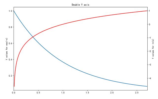
自動生成一個例子
x = np.arange(0., np.e, 0.01)y1 = np.exp(-x)y2 = np.log(x)fig = plt.figure()ax1 = fig.add_subplot(111)ax1.plot(x, y1)ax1.set_ylabel(’Y values for exp(-x)’)ax1.set_title('Double Y axis')ax2 = ax1.twinx() # this is the important functionax2.plot(x, y2, ’r’)ax2.set_xlim([0, np.e])ax2.set_ylabel(’Y values for ln(x)’)ax2.set_xlabel(’Same X for both exp(-x) and ln(x)’)plt.show()
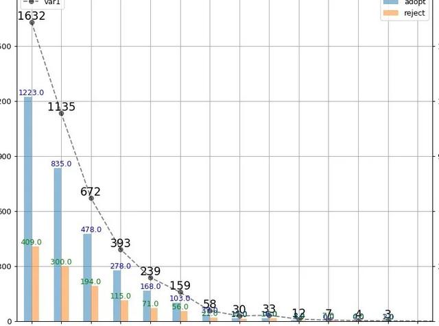
例子:畫了一個雙y軸坐標的圖表
# -*- coding: utf-8 -*-#調用包import pandas as pd import numpy as np import matplotlib.pyplot as plt#讀取文件io=r’E:工作專項白騎士數據驗證白騎士數據匯總表.xlsx’yinka=pd.read_excel(io,sheet_name=’YINKA_sample’)bqs=pd.read_excel(io,sheet_name=’BQS_result’)yinka_bqs=pd.merge(yinka,bqs,left_on=’no’,right_on=’no’,how=’inner’)#繪圖fig,ax=plt.subplots(1,1,figsize=(20, 300))ax.grid() #畫網格x=total.index-1 #為什么+1,因為對不齊,所以使用時根據情況編寫y=total[’var1’]ax.plot(x,y,’k--o’,alpha=0.5) #畫折線圖ax.set_xlim([0,16]) #設置x軸的取值范圍 這個可以讓x軸與y軸的起點一致ax.set_xticks(np.arange(0,16)) #設置x軸的刻度范圍ax.set_xticklabels(np.arange(0,16),rotation=30) #設置x軸上的刻度ax.set_ylim([0,1800]) #同理y軸數值范圍ax.set_yticks(range(0,1800,300))#設置y軸的刻度范圍ax.set_yticklabels(range(0,1800,300))#設置y軸上的刻度ax.legend(loc=’upper left’) #設置ax子圖的圖例(legend)#新知識點for a,b in zip(x,y): #設置注釋 zip函數是對應關系 ax.text(a,b,b,ha=’center’,va=’bottom’,fontsize=15)#重點ax1=ax.twinx() #這個是能夠實現雙y軸的重點,共享x軸;還有一種是雙x軸的圖表換成ax.twiny()y1=total[[’adopt’,’reject’]]y1.plot.bar(ax=ax1,alpha=0.5) #這個是matplotlib中條形圖的繪制方法,如果使用seaborn繪制方法使用sns.barplot()函數,需要調整很多細節#這里只設置了y軸的刻度,x軸的刻度設置了一下偶爾會出現失敗,值得注意的是要將數據對齊ax1.set_ylim([0,1800])ax1.set_yticks(range(0,1800,300))ax1.set_yticklabels(range(0,1800,300))for e,f,w in zip(data_.index,data_[0],data_[1]): ax1.text(e-1,f,f,ha=’center’,va=’bottom’,fontsize=10,color=’b’) ax1.text(e-1,w,w,ha=’center’,va=’bottom’,fontsize=10,color=’g’)ax1.legend(loc=’best’)plt.show() #養成習慣這個最好寫一下##保存圖片plt.savefig(’path’) #圖表輸出到本地
結果顯示:
總結
到此這篇關于Python matplotlib 繪制雙Y軸曲線圖的文章就介紹到這了,更多相關Python matplotlib 曲線圖內容請搜索好吧啦網以前的文章或繼續瀏覽下面的相關文章希望大家以后多多支持好吧啦網!
相關文章:
 網公網安備
網公網安備