文章詳情頁
css - 前端flex布局嵌套內層的布局不起作用?
瀏覽:202日期:2023-01-19 10:27:49
問題描述
<!DOCTYPE html>
<html lang='en'> <head><meta charset='UTF-8'><title>Document</title><style type='text/css' media='screen'> .box{ width: 200px; display: flex; height: 200px; background: skyblue; flex-direction: column;} .first{ height:30px; width: 200px; background: red;} .second{ flex-grow: 1; background: pink; style:flex;} .third{width:100%; height: 30px; background: yellow;} .fourth{ width: 100%; flex-grow: 1; background: gray }</style> </head> <body><p class='box'> <p class='first'></p> <p class='second'><p class='third'></p><p class='fourth'> </p> </p></p> </body></html>這樣做class為fourth的標簽的高度就無法自適應了?該如何解決這個問題?
問題解答
回答1:修改一下入下圖的地方
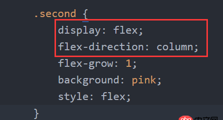
謝謝,我怎么說我項目中的代碼不起作用,原來是多個分號。。。找的我好慘
標簽:
CSS
相關文章:
1. PHP單例模式2. javascript - 微信報redirect_uri參數錯誤3. node.js - webstorm中下載mongoose的錯誤4. 我在centos容器里安裝docker,也就是在容器里安裝容器,報錯了?5. android - 類似微信朋友圈或者QQ空間說說那種點擊圖片放大,并且有放大縮小手勢,左右滑動圖片手勢效果6. win10系統 php安裝swoole擴展7. html5 - 如何禁止百度轉碼?8. 黑客 - Python模塊安全權限9. javascript - 怎么簡寫這段jQuery功能?10. python - mysql 如何設置通用型字段? 比如像mongodb那樣
排行榜
 網公網安備
網公網安備